
Shield Shirkers – #01
This Ayr United badge redesign is the first in a planned series of Scottish football clubs. If you don’t understand why I’ve started with Ayr then read up on fitba badges in the firing line.
Club history
Ayr United Football Club formed from a merger between Ayr FC and Ayr Parkhouse in 1910. One theory about their badge is it’s a ‘neutral’ image both sides could agree on. I’m not sure when or why it came about but the saltire and shield shape come from Ayrshire’s original coat of arms (if not its colours).
The Saltire

I had always wondered why the Scottish saltire was so prominent in Ayr United’s badge. I suppose it’s not that different from Turkish clubs using their country’s crescent moon. Since working in the Public Sector I can’t help associating Ayr’s badge with the Scottish Ambulance Service (insert your own joke here!).
To be fair, Ayr have a few national connections. Their nickname, The Honest Men, is from a poem by the ‘national bard’, and proud Ayrshireman, Robert Burns. Ayr also have a strong link with former Scotland manager Ally MacLeod. If you visit Somerset Park you can’t miss the slab of concrete named after him (there’s a wee hint of 1978 optimism in calling it a ‘suite’). MacLeod finished his playing career at Ayr and managed them to promotion in the late 1960s and early 70s. Around that time the team started wearing a version of the current badge on their shirts.
Nail your colours to the mast
I think the top of the badge is a reference to rope used on boats and Ayr’s harbour. The red ball might be a similar vintage to the one shown in the Tottenham Hotspur badge. The ‘A’ and ‘U’ hanging out the sides of the rope were one thing I wanted to sort out in the redesign. Also, the fact Ayr play in black and white but their badge is mostly red and blue. Blue seems a bit odd as it’s the colour of their biggest rivals, Kilmarnock FC.

Then there’s the Lord Lyon ruling that threatens Ayr’s badge. The crucial point is whether or not it can be ‘described heraldically’. Heraldry is basically a kind of code that tells you what to draw in a coat of arms. It uses very old jargon that can be difficult to pick up. I’ve attempted to describe Ayr’s current badge, below (except the letters – no guarantees it’s correct!). I’ve shown the heraldic ‘tinctures’ in their respective colours to try and help decode them. The first colour always describes the shield background colour. After that it describes the lower part then the upper rectangle (‘in chief’)…
Azure a saltire argent, in chief argent, a roundel gules wreathed argent.
Any port in a storm

I took inspiration from an overlooked part of Ayr’s history. According to the fascinating Historical Kits website, Ayr United wore a stylised anchor badge either side of WW2. It was quite unusual for football clubs to wear any badge in the 1930s or 40s – most had plain shirts. I can’t help seeing the anchor as a face with brow, nose and mouth. The sharp angles somehow make it look smiley and mean at the same time.
Ayr United badge redesign
The idea for the redesign came once I realised that adjusting the angles at the top of the anchor made it fit in with the saltire. I had to make the anchor slightly longer to allow spaces at the sides (the original has roughly equal width/height). I like how the sides of the saltire look like even bigger hooks. Also, the top circle fits the position of the loop at the top of a traditional anchor. I wasn’t sure about the style of the ball but settled for the simple pattern as it matches the braid in the rope. Ayr Utd were founded in 1910 so I used a typeface from that period for the text (News Gothic).

(Background image adapted from: Somerset Park, Martin Le Roy, CC BY 2.5)
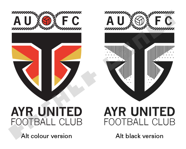
It’s standard practice in logo design to do a black-only and white-only version (especially for printing on plastic products). It’s important that Ayr’s badge works on both light and dark backgrounds as it can never appear inside a shape (or it could be considered heraldic again).
Kit and other applications
Since black and white are Ayr’s colours, I think the black version could work quite well on their home shirt. Single colour shirt badges can be cheaper to produce. They’ve also been in fashion at many big clubs, especially in the English Premier League.
Going on the colours from the old Ayrshire coat of arms, I think it could also look good in a black and gold away strip. I like the fact ‘AU’ is also the symbol for gold (I remember it because of the James Bond baddie, Auric Goldfinger).
The simple block of text can be scaled up and aligned to the side of the anchor for use on stationery or signage.
Tackling heraldic issues:
- The redesigned badge has openings at the side. Since it’s not an enclosed shield, it can’t be described heraldically.
- There isn’t a complete Scottish saltire in the new badge – the anchor covers it.
- Anchors in heraldry would usually be positioned within a shield or above it, as a crest (like Airdrie’s cockerel). The modern style and position would be difficult to describe.
- The previous ball could be described as a ’roundel’. Making it clear it’s a football helps as they weren’t invented in heraldic times.
- The triangular segments in the middle of the badge might be described as ‘gyrons’ in heraldry. However, the way they join and overlap can’t easily be described (it’s not a traditional ‘gyronny’ pattern, like the Campbell coat of arms, for example).
What now?
The unfortunate thing about all this is it’s not just an exercise. Since late 2015 there has been a real threat hanging over Ayr United’s badge. I’ve put this together as a Scottish football fan trying to make some kind of contribution. I think all Scottish clubs should be able to keep their traditional badges – I understand no-one wants to be forced to change. The above design is just one option in case the worst comes to the worst (as it did with Airdrieonians, Formartine United and others).
Update
According to an Evening Times article: “Ayr United have been granted special dispensation to continue using their crest until June 2017, although they will be forced to adopt a new badge from the 2017/18 season.” This explains why Ayr Utd kept their existing badge on their 2016/17 kit. Airdrie and Formartine were also given a ‘grace period’ when they were told to change.
Ayr United held a competition and chose a new badge design in April 2017 – see the update on my Ayr Utd badge – runners & riders post.
Hi there. I am the club historian for Ayr United FC and it is not helpful to be tampering with the badge in this way.
Hi Duncan. As I say above, I hope you can keep the current badge. If not, my design could be useful to explain the issues. You’re entitled to your opinion and I, and others, also have freedom of expression. All the best for the end of the season when it comes.
Hi Duncan, I am not a great fan of the suggestions here but I took it as an honest and well-intentioned contribution so for that I thank the poster for his efforts. I’d prefer a badge showing a rocket up the a*se of the Lord Lyon…we should adopt that badge from next season.
I appreciate that – I knew my designs wouldn’t be to everyone’s taste. I think I’ll leave the rocket idea to someone else!
I have little hope that the badge will stay as it is, following the intervention of the “men in tights”.
You have obviously put a great deal of thought into your design, which in my opinion could work well towards complying with the laws being enforced by the Lord Lyon King Of Arms, whilst still retaining much of the character of our present badge. Also worth consideration is your suggestion of the use of the red and gold colours of the Bruce crest which was used in the original county coat of arms before 1931, which could be quite striking on strips and merchandise.
I have no doubt at all that by next season the badge will have to change, and that really leaves little time to get things in motion to consider the way forward. The first question to be addressed by the club will be whether to try to incorporate elements of the present badge as you have done or have a completely new design produced for a badge/crest. My own personal choice would be to go along the lines you suggest, which I consider a well thought out solution to the ridiculous position the club find themselves forced into. Goodness knows how many others will have to follow.
Well done on your efforts.
Thanks very much for your comment Alasdair. I’m glad you liked the design and understood what I was trying to do.
You couldn’t post a version of your design with the gold and red colouring of the saltire could you ?
Thanks for the suggestion. The away kit example gives a hint of that but it would need to work on white or any background colour. Filling in the saltire would make it an enclosed shape again (that could be described heraldically) but there might be a way around that. Leave it with me…
This alternative version is a bit of a compromise. Changing the colours to black, gold and red means it doesn’t have the same contrast as before. It needed a white outline but that covers part of the saltire and affects the points of the hooks. The diagonal angles aren’t as clear in this design – probably not helped by me sticking to heraldic ‘hatching’ in the black version. See what you think…
FYI D, as you say the County coat of arms shows red and gold and at various times the predecessors of Ayr United wore those colours, as did AUFC during its first four years.
Your attempts will only be met by resistance. What you are doing is potentially damaging.
Hmmm, so you didn’t read the above comments? If you need more windmills to tilt at, try this attempt or this design.
Looked at the other two – The first would be OK but I fear it would lose any definition without a border of sorts around the ‘shield’ shape.
Don’t really like the second one with Ailsa Craig and the Town hall steeple – looks more like a tourist board advertising logo.
I await someone coming up with a badge containing a representation of Burns’ Cottage or even The Bard himself as another alternative !
Duncan, instead of posting snippy one-liners, why not explain why it’s damaging?
“Your attempts will only be met by resistance” – jeezo.
Unfortunately Duncan, when it comes to The Lord Lyon King Of Arms, resistance is generally futile. If you can influence the ‘men in tights’ to allow the club to retain the present badge then I applaud you, but the club should be looking at the way forward, as a worst case scenario, if all reasoning with the authorities comes, as I suspect it will, to nothing – leaving the club without a badge and little time to get something in place. The discussions and consideration of possible alternatives really need to start very soon……I think of the two colour schemes I prefer the saltire based one rather than the red/gold colouring of The Bruce shield……I think, in the far off past, Ayr may actually have played at one time in a red/gold hooped strip (Duncan will be able to confirm that one)….if so, could the colours maybe have originated from the same Bruce shield source ?……Wouldn’t like to go back to that colour of strip though…..black & white for me !!………………….I follow with interest the next stage of the fight with authority to retain the present club badge.
Hi Alasdair – just catching up after holiday. I think the strip you mention came from Ayr FC when United were formed. See the ‘Ayr… WW2’ link to Historical Kits website (next to original anchor badge, above).
I am quite angry about the badge ruling but I don’t see this post as a threat to the current badge – the current badge’s days are already numbered unless there is a dramatic u turn.
I’ve not seen anything from the club on this issue, maybe work is happening we don’t know about but we’re now in 2017 and, unless something changes, a new badge is needed.
Let’s have the debate. Well done on what I think is quite a respectful attempt to address an emotive issue.
Thanks for your comment. I’m glad that came across. It seems to have contributed to a debate here…!
I can confirm from an unquestionably reliable source that the use of the present badge will cease after the current season, the Lord Lyon having agreed dispensation to have it used on strips etc for the remainder of the 2016 – 17 season. Consequently the redesign debate is now real and becoming more and more urgent by the day. Awaiting the process by which the club will decide on a new badge going forward.
You should get in contact with commercial@ayrunitedfc.co.uk as they are looking for badge submissions.
Hi Aaron – sorry, your message got lost in the ‘spam’ folder. Thanks for saying. The club’s competition seems to be aimed at Ayr fans only. I wanted to show an alternative but I wasn’t going to enter. I’ll maybe ‘phone a friend’ on that one.
Your source should also be able to tell you that any new badge will only be temporary.
I’ll go back to the Director concerned then !
Excellent – even inspirational – creative work taking into account all the “requirements”. According to the Scottish Flags Trust, any Scottish person is entitled to fly or wear the St Andrew’s Cross (“azure, a saltire argent”) as a mark of their patriotism or national identity. So clubs would seem to have a right to it. And further, if the badge or crest is not displaying a “blue and white” saltire, it’s not the Scottish flag and isn’t the business of Lyon! Black and white or other colours should be even more safe! Finally, the club “historian” should not be judged too harshly for being unable to look forward!! I look forward to Rangers, Middlesborough and Chelsea having their lion rampant taken off them – I believe by a statute of 1555 that’s still punishable by death!!
Thanks for your comment. Unfortunately, you can’t assume things that are okay for flags will be okay in heraldry. Coats of arms represent an individual (and their bloodline) or an institution. An institution using the Scottish saltire suggests it’s national. Only applies to “azure, a saltire argent”, which may be why the old Ayrshire arms have a red and gold saltire. Lord Lyon only covers Scotland so Chelsea, etc. are safe. Rangers added a football to their badge which can’t be ‘described heraldically’. See my other posts for more info…
I think your design is excellent, I’d be happy with that badge. Duncan Carmichael clearly had his head in the sand when he made his initial response. I hope the Club pays heed to what is and isn’t acceptable when they select an alternative.
Thanks for saying – glad you like it. Part of the reason for designing it was to make people more aware of the issues. That’s why I did the new post in the Football section too.
I think the whole issue is a farce but really like your effort!
Jack – Glasgow Hibernian
Hi D,
Being an Ayr United fan I found this article a really interesting read and I was impressed with your different badge designs. [Edited…]
Kind Regards,
Jonny